One of my favorite things to do as a designer is to do visual redesigns, but admittedly, I pretty much love all of the things I do anyways. Visual redesigns are a lovely way to take a pass at updating visual elements before improving the user experience. This can be helpful for wrapping your mind around some of the nitty-gritty details of the current system before diving into wireframes and making changes. Visual redesigns are also important because they help improve user interaction, not to mention update the look and feel. If you read my post from last week, you are already aware of the work we are doing to improve our Drupal experience manager. A few weeks ago, I introduced you to the research portion of our work, in which we:
-
Created user personas
-
Performed user interviews
-
Audited our current system and compared it to other CMSs
This week, I will show you the work my team and I did to redesign the visual elements our Drupal experience manager. The purpose of this redesign was to customize the visual elements from Drupal 8’s basic setup, including type, color, components, and icons. Our improvements continue to make content management easier for our clients' sites built on Drupal.
Type
Many CMSs take a minimal approach when it comes to type. Our old favorites Helvetica and Arial are common on content management systems. Some, like Squarespace, will add other fonts to create a sense of style and help with hierarchy. Helvetica is a perfect font for when you want something to be unobtrusive, but still easy-to-read. However, we wanted our typeface to be more stylized and unique. The typeface we wanted had to be:
- Open source
-
Legible and capable of scaling well
-
Available with a variety of weights
-
Stylized enough to be unique, but not so unique to be distracting
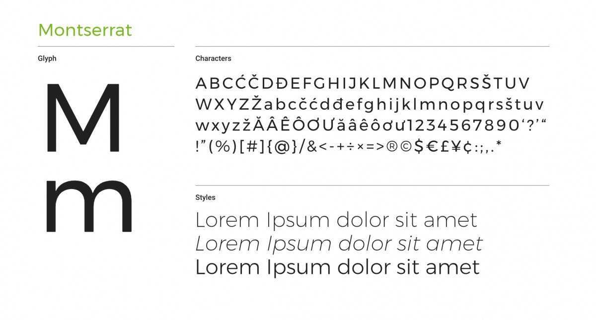
With these elements in mind, our team decided on the Google Font called Montserrat. Montserrat is an urban typeface inspired by the early 20th century posters and signs in the traditional Montserrat neighborhood of Buenos Aires. This typeface stands out while still being subtle enough to not distract users as they navigate the CMS. Montserrat is highly flexible, with 18 styles to choose from and two sister fonts.
Color
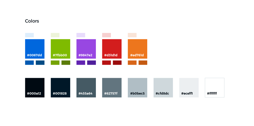
Color palettes applied to content management systems tend to vary more than fonts. WordPress uses various shades of blue (though they offer customized themes), Squarespace uses grayscale, Craft uses cool grays and desaturated warm colors, and the list goes on. With our colors, it was important to provide a set of options that, when applied, helps to drive the user’s journey. Because of this, we chose colors with high contrast and visibility. These colors, when applied to buttons and fonts, provide clear direction to users navigating the CMS.
It was also essential to provide a large set of colors and differentiate between primary colors and secondary colors. This helps our developers when they need colors in unique situations. For example, an important alert should be clearly different than the primary colors and give a sense of awareness and possibly urgency. In this example, a color such as red would be a good fit.
Our selection of includes some of the colors of our brand, specifically the bright blue and grassy green. In addition to these, we have included several secondary colors, as well as a set of cool grays. Here is the palette we put together:
Icons
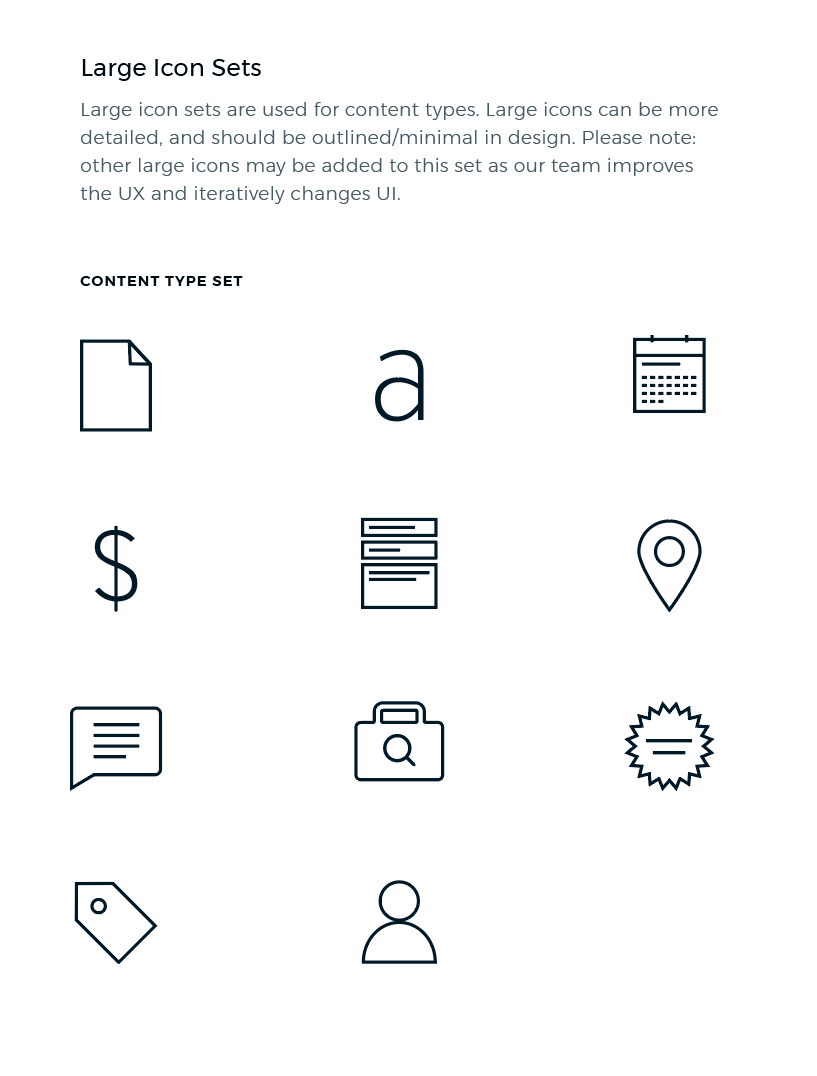 Icons play a key role in content management systems. Often icons are paired with actionable items, so using them can help users scan the interface and find elements that they need to move forward. Over time, they can also help users learn page layouts, which helps them complete tasks quicker. Icons should rarely be used alone in a CMS, more often than not they should be paired with a label to help communicate the associated action that comes with selecting an icon element.
For our icon sets, we have three styles: icons to be used at large sizes (mostly for adding new content), icons to be used at medium sizes, and icons to be used at small sizes. At large and medium sizes, icons have an outline effect rather than a fill effect. At small sizes, icons have been filled. Small icons do not generally fair well as outlines, though we have made some exceptions for our WYSIWYG editor set. These icon sets will not only serve users as they navigate through their tasks but will also emphasize our the new style of our Drupal experience manager. As we work towards improving this system’s user experience, we will likely add on to our current icon library.
Components
“We’re not designing pages, we’re designing systems of components.” — Stephen Hay
When designing apps and products, it is important to consider components. Components help build the visual system, from the “atoms” of the design all the way up to the pages. By establishing components and building them into fully fledged systems, we are able to see a cohesive whole and a collection of parts at the same time. This establishes a strong hierarchy that can be carried through to new designs. Here is a portion of the components we designed as an example of how components appear when out of context:
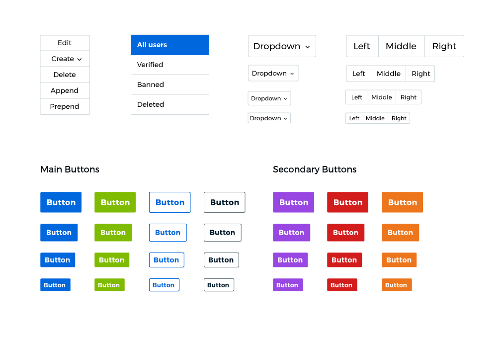 Our system will change and grow as we develop the user experience; however, by establishing these pieces we will be able to go from wireframe directly into development without having to design every single page of the system. In the future, if we do need to design new pages, we can use these components to build them out faster.
Putting It Together
So you have seen the parts, but how does it come together to create the new design? Well, without further ado, here is a preview of the new Drupal experience manager design:
As I have mentioned, the UX of our system is going to be updated, so as we work on those improvements the visual design will change. Stay tuned for the next steps as we improve our Drupal experience manager. As a self-proclaimed nerd, I am endlessly excited to have worked on this redesign and would love to hear your thoughts.
Curious how we got here? Check out the research and analysis that came before the visual design.